PBR Releases New Player Profile Performance Tiers
September 17, 2021
Since its inception in 2005, the Prep Baseball Report has strived to be at the forefront of player data collection and how it is presented to a national audience of players, coaches and scouts.
Using PBR’s new Performance Tiers interactive visualization tool, players easily can now see in real-time how they stack up against members of the same class as well as at the state and national levels.
The purpose of the Performance Tiers is to compare a player’s recorded performances to that of their peers. The result of that comparison is presented via a Performance Bar (below) that can be found on every PBR Player Profile page for any trackable performance metric (e.g., 60-yard dash, Bat Speed, Max Fastball, etc.).
Here is an example Performance Bar for Exit Velocity (MPH):

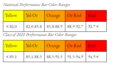
From yellow to orange through red, the Performance Bar uses distinct color shades to indicate the Low-Medium-High ranges for a specific metric. Having a value closer to the low (yellow) side indicates that the player’s performance in that metric is lower than that of their peers. A roughly average value will put the player in the medium tiers (orange), and a high value will land close to the red.
Every High School player is a part of three different peer groups: National, National Class, Regional Class. The National group contains all High School players for that year. From Freshmen to Seniors, every PBR athlete across the country in High School that has data will be a part of that group.
National Class also compares all players from across the country but limits the group to just the player's listed class. Region Class, the smallest peer group, features only players from that player’s same class and designated region.
To best illustrate the three High School player peer groups, a Class of 2023 player example is below.

A player’s metric value for each specific category is reflected in their corresponding Performance Bar. Though the Performance Bar has the potential to shift in either direction based on a player’s performance, it can also be impacted by the overall performance of players in the same underlying peer group as well as any population shifts in those groups.
Using the same Exit Velocity example as before, we can see the potential variance in a player’s Performance Bar across two of the three different peer groups.

For College (primarily JUCO) data that is used to generate Performance Bars, National and Regional distinctions are used but contain only players listed as College players. Class distinctions are not included as an option for this grouping of players. In general, the Regional distinction can be thought of as the state of residence.
Ultimately, PBR’s Performance Tiers visualization tool will provide players, coaches and scouts alike with the ability to both evaluate and contextualize a player’s performance and development across multiple peer groups.
